LEWIS Communications
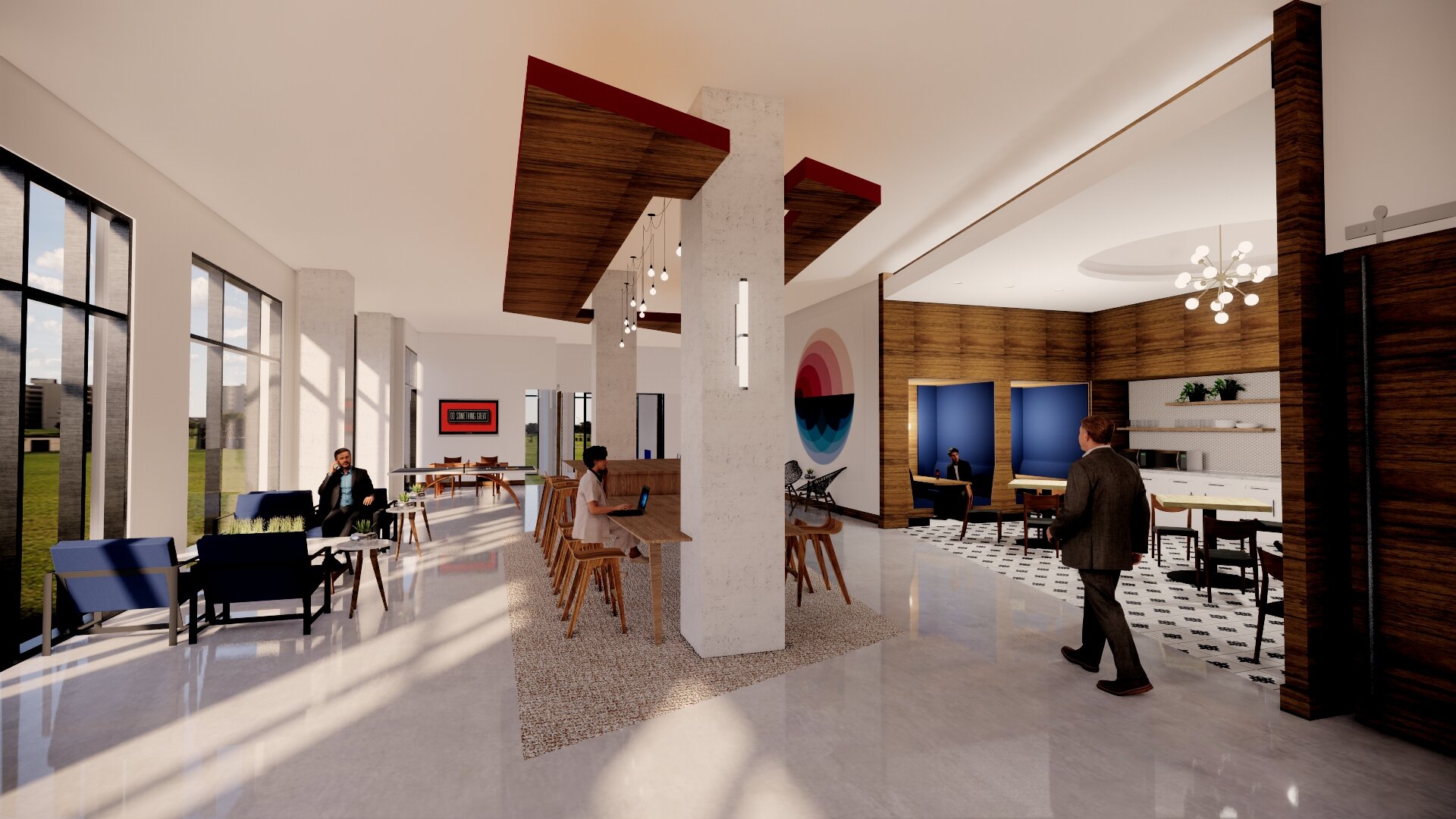
Lewis Communications is a renowned advertising and public relations company that prides itself on its innovative approach to design and style. When it came to creating the interior of their office, they wanted to embrace a fusion of mid-century modern aesthetics with a contemporary twist that reflects the tastes and trends of 2019.
The choice of materials played a crucial role in achieving the desired look and feel. Concrete, wood, and steel were selected as the primary elements for the finishes, providing a perfect combination of durability and elegance. These materials not only added a touch of sophistication to the overall space but also created a sense of timelessness.
To infuse the environment with a sense of modernity, clean-lined and contemporary furniture pieces were carefully selected with the help of Cathy Waters at AI Corporate Interiors. This meticulous attention to detail ensured that every corner of the office exuded a sleek and up-to-date ambiance.
the workstations are more like furniture than cubicles
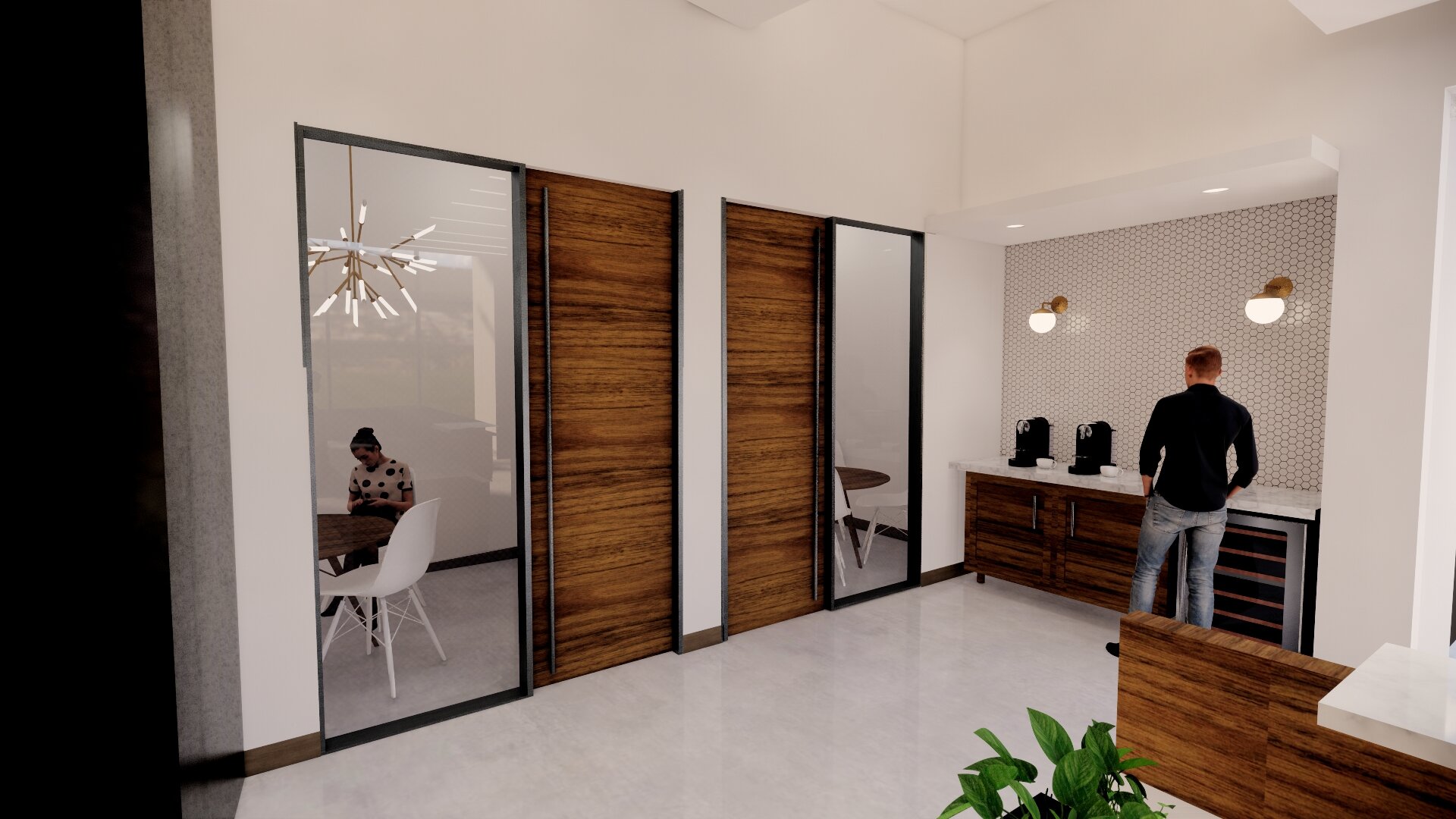
But what truly set Lewis Communications' interior design apart was the incorporation of custom and personal touches. Above the cabinets, laminate was used, cleverly expanding the overall scale of the break area. This ingenious utilization of space not only elevated the functionality of the room but also contributed to its visual allure.
Adding another dimension to the office's visual appeal, a painted stenciled logo was strategically arranged to simulate a tile pattern. This unique application of the company's emblem was a creative way to infuse the space with brand identity while maintaining a cohesive design theme.
Additionally, subtle pops of color were incorporated throughout the office space, injecting an element of intrigue and excitement. These thoughtfully placed accents created visual interest and kept the overall atmosphere lively and vibrant.
The result was an office space that seamlessly merged the elegance of mid-century modern finishes with a contemporary twist. Lewis Communications had successfully crafted a space that was not only visually stunning but also conducive to productivity and creativity.
team:
contractor: thomas constructors
furnishings: ai-corporate interiors
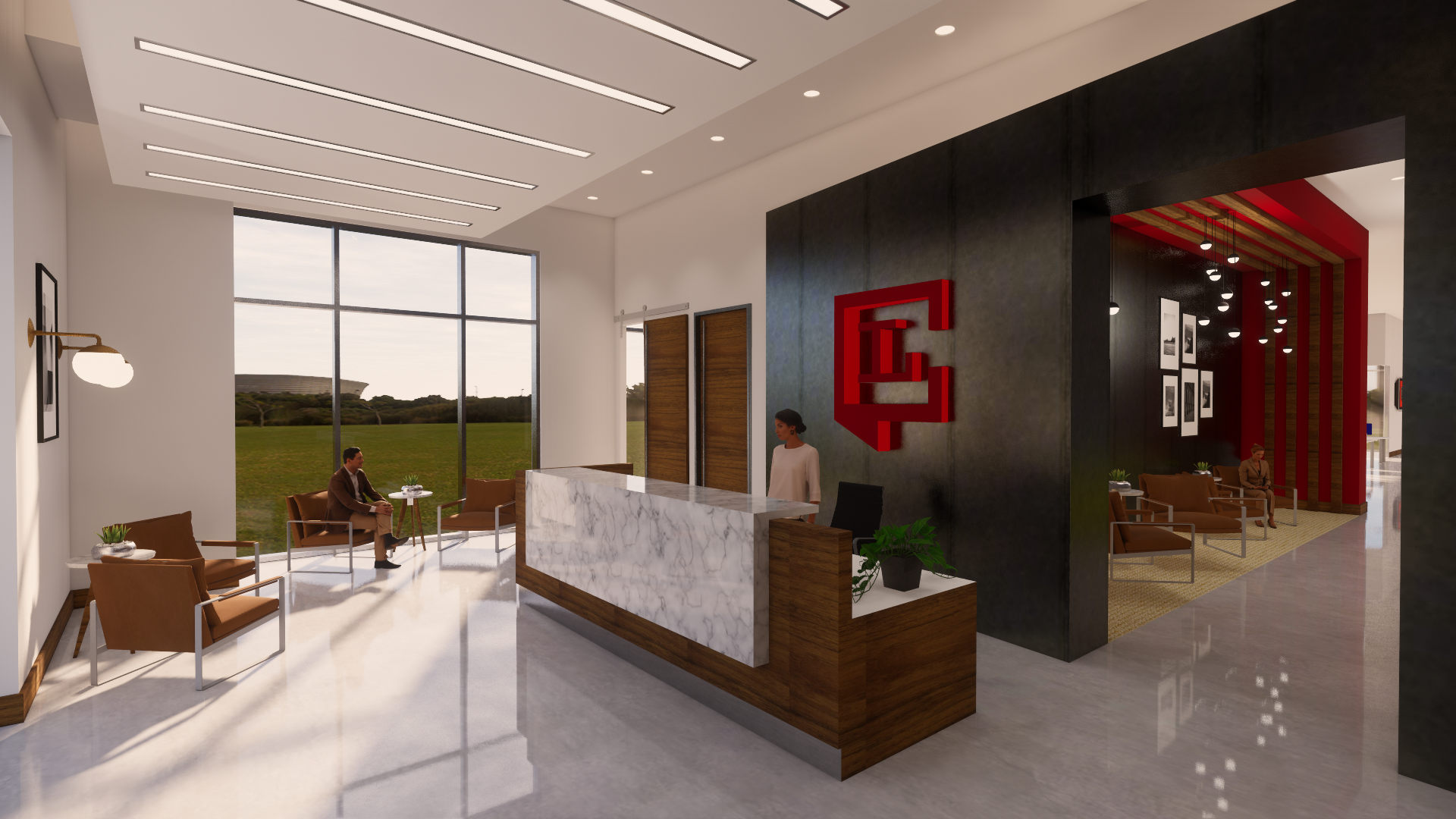
custom logo design completed by our own design team
Stencil design applied directly to the concrete by our own design team, resulted in a one of a kind autographic element to the space.
conceptual renderings of the space help convey the final look.
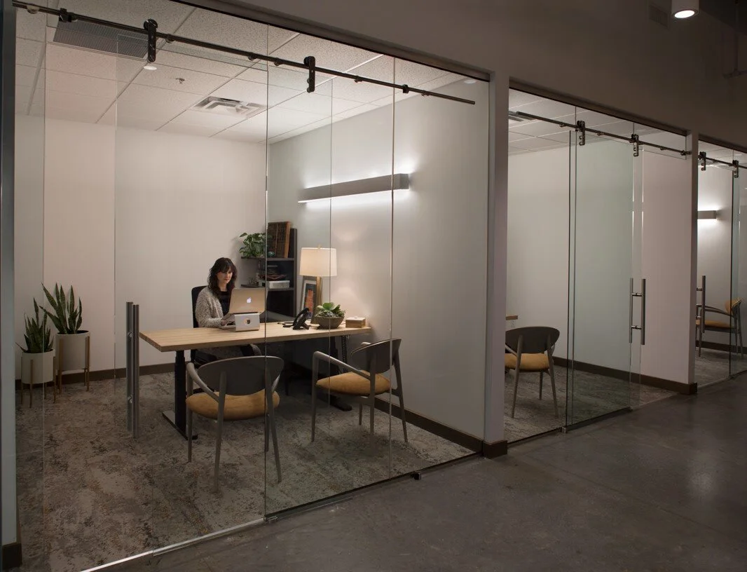
simple glass fronts to the offices and overall lighting is indirect from wall mounted sconce type fixture.


